Saturday, December 25, 2010

Complexion


From Reilly's notes:
"The complexion should be first comprehended as a generality. Visualize at the start of a painting the model at 200 ft. All the colors of the model would average out into a generality. As the painting would proceed to completion, technically the model would come closer and closer and as this happens the complexion would then divide up into smaller color changes for you to paint into the chosen basic complexion."


On the Head:
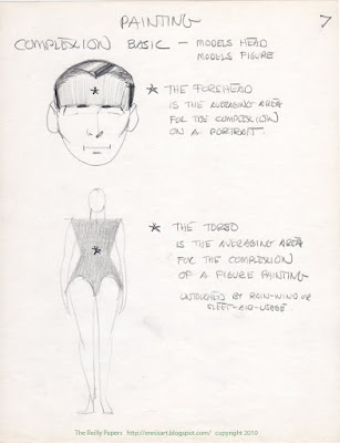
The string of complexion flesh tones on your palette, chosen from the forehead for a portrait, represents the average of the subject's complexion, as if seen from a distance. Once this average is laid in, you will begin to see and make local changes. Remember, we are thinking in terms of hue, value and chroma. In general, the middle area of the face becomes darker (value), redder (hue) and stronger (chroma) than the average, while the lower section is darker and weaker than the average, as Reilly illustrates below.


On the Figure:
On the figure, where the complexion average is drawn from the torso, you will see the complexion become darker, redder, and stronger as it approaches the extremities.


Here Reilly illustrates differences between a light, middle and dark complexion. 
© 2010 John Ennis

Next topic: The Lay-In


Saturday, December 18, 2010

The Color Note

ColorNote On Wash-In ©1955Allison
In the Reilly class we spent the first half-hour of each session drawing from the model, the remainder of each session would be devoted to painting the figure. A pose would be set on Monday and kept for the rest of the week, giving us the opportunity to complete one figure painting each week. Monday was devoted to the Wash-in which would dry overnight. On Tuesday we mixed the palette and would begin the Lay-in. As the complexions were mixed we developed a color note, a small 4"x6" oil sketch of the figure in the corner of the canvas, to verify that the palette "averages" would represent the model's local (specific) complexion in light and shadow. It includes the background averages simply stated, the whole thing taking no more than 15 minutes. The color notes should represent the "Poster"; a simple but comprehensive statement of flat shapes and major color averages. This insures that your color choices, including the complexion, are in balance with entire painting.


From Reilly's notes:
It must show the kind of light. The color of the light, the position of the light and its size, distance and strength relative to the model. In this illumination it must describe a particular condition of skin (in general first) in a chosen particular pose.
The model must exist in atmosphere (air) in front of a background.
Put in light & shadow only, on each object or area.
Put in 3 lights and one shadow on the model.
Put in known quantities.
Put in extremes- darkest first, then lightest. Strongest chroma then weakest chroma.


    © John Ennis 2010

    Next Topic: Complexion

    Tuesday, December 14, 2010

    The Reilly Palette: a Palette of Convenience

    To set up the figure-painting palette, you must first create the string of neutral control values described in the previous post. By the 1970's the Grumbacher Reilly Neutrals were no longer available. In the Faragasso class we sometimes skipped adding Raw Umber, perhaps for the sake of expediency, finding that the cooler grays worked well in neutralizing flesh. Gamblin makes three useful grays, calling them Portland Grey Light (v.8), Portland Grey Medium (v.6) and Portland Grey Dark (v.4). Their Munsell value designations are on the tube label. You can intermix to get the rest, and you can mix those with the Raw Umber string to create absolute neutrals. You might consider contacting Gamblin and encourage them to expand the line of Portland Grays to include all nine values. 


    Local Colors
    Place store-bought colors adjacent to the Neutrals at their appropriate value. Paints that will help make local colors, e.g. blonde hair, blue scarf, green drapery. Many of the dark paints accumulate around the first or second value, and for convenience I move them to the far edge of the palette.

    Convenience Colors
    The next mixtures on the flesh palette are part of what Reilly called a "Palette of Convenience". First create a string of yellow-red (orange) values, and a string of red values. These additional strings of paint will correspond in value to the Neutrals.


    A schematic for the palette, most likely done by a student. It shows Cadmium Orange
     at value 6, and employs manufactured paints for the red values of 5,4,3,2 and 1.


    Yellow-Reds
    To create the yellow-red string begin by mixing Cadmium Orange which, depending on the brand, comes from the tube at about value 6 or 7. Add white for lighter values and mix with Burnt Umber for darker values.

    Reds
    The red string begins with Cadmium Red Light, which, again depending on the brand, comes from the tube around value 5. Add Titanium White to get the lighter values. Create an admixture of Alizarin Crimson (a cool red) and a little Burnt Umber to achieve a true red at first value, and mix this with Cadmium Red Light to make the red values 2 through 4.


    Complexion
    Finally, to create the string of complexion values, cross mix each neutral value with it's corresponding value of red and yellow-red to arrive at the average complexion at that value. That mixture will depend on the models complexion average, i.e. pale and cool, warm and ruddy. Try to keep the hue and chroma consistent. Remember this is the complexion average, as you might see it from across the room. The local changes (red nose, gray chin) will be addressed as you paint. 


    In general the human complexion ranges from red to yellow-red, from pale to colorful, from dark to light. Reilly's palette facilitates mixing the subject's complexion while allowing for these local changes that occur in the flesh. Mixing this palette is time consuming, but it becomes a time saver when it really matters, during a live sitting. A palette of convenience.


    In class we mixed a drop of oil of cloves into each pile of paint to extend the drying time. The palette would remain wet all week this way and so would the paint on the canvas. Be forewarned that this may also extend the drying time of the painting. There are other ways to keep your palette wet; by submerging the palette under water, or freezing it. I prefer to mix and tube the colors, so that they are always at the ready. Empty tubes are available at some art suppliers.


    © John Ennis 2010


    Next Topic: The Color Note


    Saturday, December 4, 2010

    The Reilly Palette: The Reilly Neutrals

    At the core of Reilly's Universal Palette is a scale of equidistant value steps called the "Neutral Control" values. The main purpose for using a scale of values is to help control the values in your picture, enabling you to create form, the illusion of three-dimensions on a two-dimensional surface. Getting your values correct can be the largest factor in accomplishing this. Reilly attributes 80% of our success in getting the form to correct values, 20% to chroma, and 0% to hue.


    A scale of nine value steps made by mixing Titanium White with Ivory Black produces cool grays with a slight blue bias. A scale of nine value steps made by mixing Titanium White with Raw Umber produces warm grays with a yellow bias. "Neutral Gray" can be arrived at by  mixing the cool gray with the warm gray at each of their nine value steps. The full range of neutral values includes both extremes white and black. White is designated value #10,  black is value #0 and between them are values #9 through #1, comprising the eleven-step scale of Neutrals.  Your judgement of true "Neutral" (with minimal spectrum bias) might best be determined under a north-light source.


    The Neutrals can also be used to control the chroma of any color without altering its hue. (Mr. Reilly preferred the specific term Neutral to mean a pigment that has no hue bias, while the casual term "gray" can imply very weak chroma of any hue)Oil paint comes out of the tube often at it's most chromatic. These neutrals can be used to reduce the chroma without changing the hue. For example, if your goal is to make a middle value muted purple (P5/6), you might take Dioxazine purple (P1/12), add white to bring it to value 5, then add Neutral 5 until it's chroma is weakened sufficiently. 


    In the late '40s, Reilly contracted Grumbacher to mix and tube boxed-sets of all nine Reilly Neutral values. Sadly they are no longer available. Tubing your own Neutrals saves time and promotes palette consistency. Empty tubes are available at art material suppliers like Pearl Paint and Utrecht. 


    Photo courtesy of Jerry Allison

    Mixing the neutrals. 
    Using Ivory Black and Titanium White, mix nine intermediate piles of paint from dark to light. Black representing the value #0 and white representing value #10, the neutral colors will be values 1 through 9. Including black and white you will have eleven equidistant values.  Next create a separate string of nine corresponding values mixing Raw Umber with Titanium White. Now, relying on your own judgement, blend these two strings together visually until they appear to be completely neutral in hue.


    Jack Faragasso's 1979 book is a good reference for paint mixing.


    For your bookshelp:  The Student's Guide to PAINTING by Jack Faragasso 
    ISBN 0-891-34025-4 


    Next Topic: The Reilly Palette: A Palette of Convenience


    © John Ennis 2010 

    Sunday, November 28, 2010

    The Munsell color notation.

    It would be difficult to advance with this project without offering a short primer on Munsell. Reilly adopted the Munsell Color System for his program, and an understanding of its basics and nomenclature is fundamental to the Reilly vocabulary.

    Munsell divides color into three components: hue, value and chroma. 


    Hue is the quality that distinguishes one color from another, i.e. red, yellow, green etc. Munsell's color wheel is a little different from what most of us refer to. Instead of three primaries of red, yellow and blue, and three secondaries of orange, green and purple, Munsell expands the wheel to 10 colors. Red, Yellow, Green, Blue and Purple are considered "Simple Hues". Between them are found the "Intermediate Hues" of yellow-red, green-yellow, blue-green, purple-blue, and red- purple. So when Reilly describes complexion as yellow-red, this is where the nomenclature comes from.

    Value is the quality which distinguishes light colors from dark colors. In this system, the gradation of light to dark is separated into eleven values. Pure black is labeled 0 and pure white is labelled 10. Nine values equally distant from each other lie in between. A color with a value of 8 is very light, two steps down from white.

    Chroma describes how strong or weak a color is. The color red with a chroma of 2 is a warm neutral, a chroma of 14 describes a brilliant red.

    So a Munsell color notation for caucasion skin tone in the light might be described like this: YR8/4. This means the hue is yellow-red (orange) the value is 8 (very light) and the chroma is 4 (relatively weak). Reilly uses these notations through-out so it is important to be familiar with them. A premise of the Munsell system is to get us away from terms like Banana Yellow or Lime Green, and offer a more specific method of describing color, and a common language through which to describe it.

    Further study of the Munsell system is suggested. There are lots of informative websites you can explore. A simple but informative guide can be found at  The Munsell Color System - Color Models - Technical Guides


    For your bookshelf: MUNSELL, A Grammer of Color by Albert H. Munsell and Faber Birren, ISBN 0442255764


    © John Ennis 2010


    Next topic: The Reilly Palette: The Reilly Neutrals

    Sunday, November 21, 2010

    Edges

    Edge modeling is an essential ingredient to successful representational painting. The first thing I look for is what Reilly called the "Big Blur". Where does the subject blend into the atmosphere? Look for areas where the value on the subject is nearly the same value as the adjacent background and obliterate the edge. This is your softest edge.

    Go to the light side and look for the main (light) effect, the focal point in the light. Establish your hardest edge here. 

    All other edges can vary between these two extremes. Hard edges help project the form toward the viewer, and soft edges help make the form recede. I use edge-modeling as a design tool to control the viewer's visual path around the painting.

    "Purple Scarf"  oil  30"x24"  by John Ennis


    From Reilly's notes:
    Edge Modeling is basically a skill, without it no painter excels. 
    It helps to create atmosphere, putting the model in the room, existing in space. 
    It relates the form to the background.
    It heightens the effect of light on the subject.
    It aids selective looking.
    It is done at every stage, Wash-in, Lay-in, Painting.

    The diagram below illustrates the variety of edges and the process for softening edges of varying hardness. The two strokes of paint adjacent to each other represent a hard edge. A slightly softer edge can be made by dragging a clean brush over the border of where the strokes meet. To create an even softer edge, take a clean brush and zig-zag the brush, pulling paint into the adjacent areas all along the length of the stoke. Then with a clean brush softly brush down over the zig-zag creating the soft transition. When the size of the area to be softened exceeds the width of your biggest brush, lay in a half-tone value, and brush the light into the halftone and the halftone into the shadow using the technique described.


    © John Ennis 2010

    Next Topic: The Munsell Color Notation

    Monday, November 15, 2010

    The Wash-In

    The initial step in the Reilly painting program was dubbed the Wash-In. It is an imprimatura, a thin translucent monochromatic layer of paint designed to develop the drawing, values, and edges while putting off the challenge of color and brushwork to another session. I created the one displayed here in twenty minutes using raw umber.


    Material list:
    Canvas
    Linseed Oil
    Raw Umber
    Medium Cup
    Varnishing bristle brush (or house painter's cutter brush)
    Cheese Cloth (or cotton rag)
    Solvent (turps or OMS)

    Oil out the canvas with linseed oil thinly, applying the minimal amount to just barely cover the surface. "Breathe it on" is how we used to describe the application. This may seem antithetical to fat over lean concerns, but it has proven to be safe.

    In a medium cup, mix one half solvent and one half linseed oil. 

    Brush on Raw Umber thinly to approximate the shadow value of the subject, dipping the brush into the medium to add fluidity to the application. Let this set for a few minutes. 

    Using cheese cloth, or a cotton rag, separate the light from the shadow by rubbing out the lights beginning with the average, or middle value in the light. After separating the light from the shadow in this way, further define the values in the light by rubbing out the lightest light, perhaps the upper chest or forehead,  then using the cutter brush, dust in the darkest light, like the underbelly of the torso. I hope to describe this better in a later blog on the Lay-In. By this approach, the figure is simplified to three values in the light and one in the shadow. 

    In this illustration, Reilly breaks the process down as follows: 
    A- tone the canvas to the shadow value. 
    B-draw in an outline of the figure. 
    C-Wipe out the average light. 
    D- wipe out the lightest light and brush (dust) back in the darkest light. 
    E-draw in the darks. 
    F- emphasize the "Effect", the lightest light in the picture. 


    © John Ennis 2010

    Next Topic: Edges