Saturday, September 10, 2011

Sky & Clouds


When my League instructor Robert Schulz offered this lecture to the class, I remember being struck by the amount of information the students were being given. Reilly's program  went way beyond teaching us how to paint, it helped us understand what we were painting. In retrospect it seems obvious that we should pay some attention to the different types of clouds in our landscape, but until then I hadn't given it much thought.


Cirrus are seen early morning or evening. They come together to form cumulus clouds in the afternoon. Stratus clouds are high in the sky and flatter. Cumulus are heaped up, but keep them light and floating. Cumulonimbus and nimbus are thunderclouds with precipitation.


All clouds have action. They are a mass of floating water vapor moved by the wind. Soften edges, pull wisps out of the cloud to show its loftiness and the action the wind puts upon it. Often the shadow side of a cloud is the same value as the sky behind it, a warm neutral against a blue sky.

Your composition will determine which values of the sky vault will appear in your picture. Thalo blue and green are mentioned here, but ultramarine blue and viridian are mentioned elsewhere and work just as well.

 A gray day sky is flat with little or no vault (change in value).

A moonlit sky has a slight value change to the sky vault.

The Rose Dore Effect.
At the end of the day, dust and pollution rise up into the lower sky and become a red-orange haze of transmitted light. Reilly called this the Rose Dore' Effect after the pigment used to get the effect.  The sky vault was painted first, and let to dry. The clouds were painted wet on dry, and the rose dore was glazed over the horizon part way up the lower portion of the sunset sky, without changing the value.

 © John Ennis 2011
 Next Topic: Trees


Monday, September 5, 2011

Landscape Palette

My pochade box with the Reilly's outdoor palette.

Reilly created a landscape palette for his students that is well thought out and allows for quick access to important colors. A derivative of his Universal Palette, it emphasizes value while facilitating hue and chroma changes much like his figure palette.

Arranging the Palette
The first row are the controls values, made from titanium white and lamp black. Lamp black is much cooler in hue than ivory, and works to influence the shadow colors with a bluish tint. 

The second row are the locals. They can be composed of cadmium lemon (at value 9), cadmium yellow light, cadmium yellow, cadmium yellow medium, cadmium yellow orange, cadmium orange, cadmium red light, cadmium red medium, cadmium red dark and alizarin crimson. It is not necessary to have all of these colors, as long as you have a string of various hues at different values. Other locals that come from the tube at value 1, like burnt and raw umber, can be added as well wherever they fit on your palette conveniently, but try to keep them lined up with the proper value.

In the chart below, a string of sky values are on the palette in quarter value increments from value 8 to value 9.5. My short-hand version of the palette above simply has sky values 8 and 9.5.

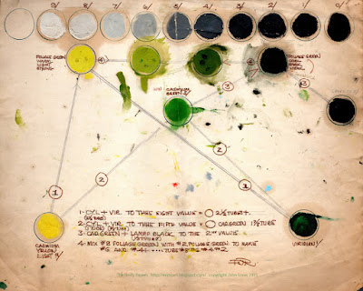
A string of green values for the foliage is created by using a formula given below.


 I have used this palette for field studies several times this summer with great success in establishing values consistent with outdoor light, and in capturing the warm color of the light and cool color of the shadow. The palette was laid out prior to going outside, so it saves precious time on location, and like the figure palette, offers the convenience of having colors on hand that only require minor adjustments in hue and chroma to achieve the desired results. Another palette of convenience!

9"x12" field study #1  © John Ennis 2011

9"x12" field study #2  © John Ennis 2011

Mixing the Foliage Colors
This illustrated chart offers a visual guide in mixing and tubing the colors. We are creating a string of greens that are at one end yellow green, light in value, strong in chroma, an at the other end blue-green, dark in value, weak in chroma. 


Begin with cadmium yellow light and mix it with viridian to the 8th value (#8 Foliage).  Mix cadmium yellow light with viridian again to create a value 5 green (cadmium green). This color is then mixed with lamp black to create #2 Foliage. Mix #8 Foliage with #2 Foliage to get #4 Foliage and #6 Foliage. Tube these four colors. Follow the formula exactly for the amount of paint indicated and you will arrive at the correct colors in the appropriate amounts.


Another view of the mixing formula for foliage.

Mixing the Sky Colors
Below, the chart for mixing sky colors. Create one tube for the sky zenith, an 8th value blue, and another tube for the sky horizon at 9.5 value blue green. In this iteration Reilly uses ultramarine blue and viridian, at other times he has mentioned thalo blue and green.


Another view of the mixing charts, this one including water. I have not found additional information to explain mixing colors for water .

Tubing the Paint
Below is a snapshot of my tubed summer colors. Empty tubes are available at Empty Paint Tubes - JerrysArtarama.com, utrechtart.com, and Pearl Paint 1.25oz Empty Aluminum Paint Tubes. They are available in various sizes from the 22ml that I used in the photo below, 45ml that I use for my fleshtones, and studio tubes. Choosing the size depends on how much you intend to use them.

To fill a tube with color, feed the paint into the open end with a narrow palette knife (or plastic butter knife) and tap the cap-end of the tube on your table to make the paint settle and remove the air. Once the tube is filled, crimp the open end shut with canvas pliers and fold it up.
22ml tubed landscape colors.
Also shown an empty 22ml tube and an empty 45 ml tube.


The Shadows
Below Reilly compares the indoor palette and the outdoor palette. Outdoors all the shadows would be cool, ultramarine blue is a great color for adding to the shadows to affect the hue. On a sunny day, these values are never darker than 2, or lighter than 8. 

The Lights
The lights can be influenced with cadmium yellow to make them warmer. These value range from 10 down to 5. Black in the light would be 5th value with a touch of cadmium yellow for warmth, and in the shadow painted at value 2 mixing lamp black and white. In the mini illustration, a white shape lays on the ground, painted a warm white at value 9 3/4, chroma 2. In the shadow it becomes a cool value 8, also at chroma 2.


© John Ennis 2011
Next Topic: Sky & Clouds


Sunday, August 7, 2011

Sunlit Color

Extreme chroma color chart in sunlight. Painted by E. Anzini.
This is one of many landscape assignments Reilly gave his students. I had my summer intern recreate this problem for the blog. It is an exercise in creating the look of sunlight, in this case a high chroma color chart in light and shade. The challenge is finding the correct value and color temperature. Reilly first required the students to create a chart in neutral gray to get the values right. The next challenge was find the right color temperature in the light and in the shadow.


High chroma color chart

We began by creating an array of hues in full chroma, sometimes out-of-the-tube and sometimes adding a little white to the darker colors. Next we assigned each color its home value, by comparing them against the values of our neutral grays. Reilly made similar value assignments in the page below. 


Sunlit value range in form lighting.


Using the value scales for sunlight, we reassigned the home values so they would appear to be in light and shade on a sunlit day. An example would be orange with a home value of 7 would be painted 8.5 in the light and 6.5 in the shadow. All the colors in the light were lightened with white and most included a little cadmium yellow (from the warm sun). The shadows included a little ultramarine blue (from the cool sky) as needed. The value and color temperature was adjusted until it looked right. Sunlight creates very little color shift on yellow, more on yellow-red, and more yet on red. It will make green appear yellower, and  blue slightly neutral.


By comparison, moonlight would have a similar approach. White (value 10) becomes 7 in the light and 1 in the shadow. The same orange color with a home value of 7 would now be about 5 in the moonlight and slightly less than 1 in the shadow. The shadows would vary very little in value. Lights would include a yellow-green pigment (moon-color), maybe lemon yellow. The shadows would be influenced by the cool grays on you palette made from lamp black and white.
Moonlit high chroma chart from the Reilly class, courtesy Jerry Allison.
© John Ennis 2011
Next Topic: The Landscape Palette


Saturday, July 30, 2011

Outdoor Theory: Lighting


Putting the sun at your back at sunset or sunrise creates a front-lighting condition. Looking into the sun at these hours can create a rim or back-lighting condition. Most other hours will produce form-lighting. 


The sun and the moon are directional point sources of light. Like an indoor incandescent light, they are (in practice) smaller than the subject they illuminate and create cast shadows. The sky on the other hand is a non-directional diffused source of light, larger than the subject and illuminating from all directions at once. Instead of casting sharp-edged shadows, a gray day creates penumbras, soft-edged shadows that gradually get darker as they get closer to the object casting. When the sun breaks out on an overcast day, the shadows don't get darker, the lights get lighter.

Some observations to consider under different outdoor lighting conditions.
Detail from the above highlighting the difference between a point light source and a diffused light source.

© John Ennis 2011
Next Topic: Sunlit color


Sunday, July 17, 2011

Outdoor Theory: Planes


Seeing the complex forms in nature as simple, basic planes is helpful in assigning relative values accurately to each item. This in turn helps give your landscape a natural look. The top of this page points out the relative difference between the basic planes. The ground becomes the top plane, receiving the most light. The slanted plane represents the hillside, and because of it's angle receives less light and consequently is one value darker than the top plane.  The trees represent the upright plane, receiving even less light and is therefore 2 values darker than the ground in the light. Translating this into painted values, the grass in sunlight is painted at 8th value, and in the shade at value 6. The upright plane (tree) becomes 6 in the light and 4 in the shade.


© John Ennis 2011
Next Topic: Outdoor Theory: Lighting

Sunday, July 10, 2011

Outdoor Theory: Sky Vault


The sky is a vaulted arch of diffused light encompassing the landscape. It illuminates our scene evenly as a blueish light-source on a clear day (or a gray light-source on an overcast day). If you go outside and look up, you will see the zenith of the sky vault which can get as dark as value 7. If you could follow the sky vault to the horizon, it will gradually lighten to value 9.5. In practice, your landscape will encompass only a small window of the sky vault.  The picture zenith (below) is decided by your composition, and the range of value in the sky vault of your actual painting may be as little as 8th value at the top to 9th value above the tree line.


Another way of visualizing this concept below. The sky arching over the landscape with values from the horizon at 9.5 to 8 creates ambient light for the shadows. The sun adds more light creating distinct light and shade differences. A good generality to remember is that outdoors there is an approximate 2 value difference between light and shade compared to indoor lighting that has an approximate 5 value difference.


© John Ennis 2011

Next Topic: Outdoor Theory: Planes

Monday, July 4, 2011

Basic Days

Top: Sky-lit or Gray day. Left: Sun & Sky. Right: Moon & Sky.


Gray Day
On a gray (or sky-lit) day the entire sky becomes a large diffused light source illuminating the landscape from the top down in a soft, gradual, nearly flat light. In these models, Reilly has assigned a local value to each picture element. The sky being the light source is the lightest at value 9. The road, locally lighter than the grass is the next lightest at value 7, followed by the grass at 6. The hillside is value 4, and the tree is also value 4. It's important to consider the gray day because this lighting helps establish the home or local values of the elements of your picture.
Gray day value study. 2011 E. Anzini


Sun & Sky
When the sun, a point light source, shines its light it brightens a landscape already illuminated by the sky. It creates a distinct light and shadow side to the objects. In this lighting, the tree remains the same in the shadow as it did overall on a sky-lit day at value 4. However, the sun-lit light side of the tree now jumps to value 6. Likewise, the grass illuminated by the sky was 6 overall on a skylit day, and is now value 8 in the light and 6 in the shadow. Its really important to understand that a sunny day is a skylit day with sunlight added.
Sunny day value study. 2011 E. Anzini


Moon & Sky
A moonlit landscape is similar to a sunny day, in that a weak point light source, the moon, lights the landscape creating light and shadow albeit with soft edges. The values of course are dampened, and the sky offers little or no secondary illumination, so the shadows go very dark.
 Moonlit value study. 2011 E. Anzini


© John Ennis 2011

Next Topic: Outdoor Theory: Sky Vault

Thursday, June 30, 2011

Painting Outdoors: Introduction

Student color note
Each summer, Frank Reilly took a number of his students to the Art Students League campus in Woodstock, NY to teach outdoor painting. According to alumnus Jerry Allison, "Studying landscape painting in Reilly's Woodstock classes was a grand adventure." Beginning in the 1940's and through the mid '60's when the Art Students League's 100-year lease ran out, his students spent the summer in Woodstock and participated in a 12 week immersion program that included landscape painting, and indoor and outdoor figure painting. 

Summer Program

Below is a roster from one summer (1949 or 1950) that includes landscape artist Clark Hulings, illustrator and portrait painter Bob Berran, and painter, author and teacher George Passantino who took over the morning Reilly class at the League when  Robert Schulz passed away in the late 1970's. Also on the roster are Jack Faragasso who continues to teach Reilly's methods at the League, and illustrator Larry Newquist. Students were on their own to find housing, but the town, already a summer tourist destination, was welcoming to the aspiring painters.


Summer roster, circa 1949-50

Frank Reilly and students

Studio at Woodstock, NY
© John Ennis 2011

Next Topic: Basic Days

Tuesday, June 21, 2011

Lighting Basics


This post on lighting was borrowed from the Light & Shade section, which I hope to get to eventually. Reilly refers to these basic lighting conditions through out all aspects of the program, so I think it's important to add it now. I will return to this topic in more detail at a later date.

There are four basic lighting conditions to consider. Front Lighting, Form Lighting, Rim Lighting and Back Lighting.

Front Lighting:
In this lighting condition there is no shadow to help give us the illusion of form. It shows minute detail and local values well. This is perhaps the most challenging and least used lighting condition for painters.

Form lighting:
As its name implies, this lighting condition helps us define the illusion of three dimensions by giving us a light side and shadow side to create form. It is our best option for showing three dimensions. Typically three-quarters to two-thirds of the subject is illuminated by the light.

Rim Lighting:
In this lighting condition, the subject is three-quarters in the shadow and one-quarter in the light. The light is actually coming from behind the subject, creating a brilliant light. The lights are compressed within a two value range, typically between 8th value and 10th value, so the changes in the light are hard to determine. Most of the modeling is done in the now expanded shadow value range. Good for dramatic effect.

Back Lighting:
Similar to Rim Lighting but with out the edge light. Also good for drama. Be careful of over modeling.

This post concludes the painting section of Reilly's program for the time being. This section focused primarily on  indoor figure-painting. I've covered the essential topics, and may add a few things in the future. Since summer is beginning I want to start blogging the landscape part of the program.


© John Ennis 2011

Next Topic: Landscape program

Saturday, May 21, 2011

Effect of Colored Lights

The color of the light source directly affects the hue on the light side of form. Within the cast shadow, it causes the illusion of the light-source complement. As Reilly illustrates in his notes below, a red light on a white object would give the white a red cast in the light, and the cast shadow would look like blue-green. 


Paint the object in the light with it's local color plus the color of the light source. 


The cast shadow is the local plus the complement. It's chroma should only be half as strong as the surrounding light area.


The chroma in the cast shadow gets slightly weaker as it comes towards the viewer, and stronger as it recedes from view. 


© John Ennis 2011

 Next Topic: Lighting Basics

Thursday, May 5, 2011

Color Vibrations

Claude Monet  "The Four Trees"  www.metmuseum.com
Reilly's original notes are missing on this topic, so I am substituting my own from the Faragasso class. Color Vibration refers to the readjustment of flat color for enhanced effect. A visual mixture of color that still represents the average. Think Impressionism or Pointillism. A flat area of color can be made more interesting by adding brushstrokes of neighboring hues, values or chroma to create a more interesting and painterly effect.


Initially try changing only a single factor, like splitting the hue. By painting red and yellow brush strokes of the same value and chroma alongside each other they blend visually to make yellow-red (orange). Or instead split the value: by painting yellow-red brushstrokes of equal chroma at lighter and darker values alongside each other they average out to the original value with a more exciting result. You can increase the variety of factors, and the degree to which you change them.


By now reading Munsell notations should be second nature to you. YR5/5 means yellow-red, 5th value, 5th chroma.


Adding more variations of color adds more interest. Be aware that the more more factors you change and the greater degree to which you change them, the harder it will be to maintain the average color you began with.

© John Ennis 2011

Next Topic: The Effect of Colored Lights