 |
| My pochade box with the Reilly's outdoor palette. |
Reilly created a landscape palette for his students that is well thought out and allows for quick access to important colors. A derivative of his Universal Palette, it emphasizes value while facilitating hue and chroma changes much like his figure palette.
Arranging the Palette
The first row are the controls values, made from titanium white and lamp black. Lamp black is much cooler in hue than ivory, and works to influence the shadow colors with a bluish tint.
The second row are the locals. They can be composed of cadmium lemon (at value 9), cadmium yellow light, cadmium yellow, cadmium yellow medium, cadmium yellow orange, cadmium orange, cadmium red light, cadmium red medium, cadmium red dark and alizarin crimson. It is not necessary to have all of these colors, as long as you have a string of various hues at different values. Other locals that come from the tube at value 1, like burnt and raw umber, can be added as well wherever they fit on your palette conveniently, but try to keep them lined up with the proper value.
In the chart below, a string of sky values are on the palette in quarter value increments from value 8 to value 9.5. My short-hand version of the palette above simply has sky values 8 and 9.5.
A string of green values for the foliage is created by using a formula given below.

I have used this palette for field studies several times this summer with great success in establishing values consistent with outdoor light, and in capturing the warm color of the light and cool color of the shadow. The palette was laid out prior to going outside, so it saves precious time on location, and like the figure palette, offers the convenience of having colors on hand that only require minor adjustments in hue and chroma to achieve the desired results. Another palette of convenience!
 |
| 9"x12" field study #1 © John Ennis 2011 |
 |
| 9"x12" field study #2 © John Ennis 2011 |
This illustrated chart offers a visual guide in mixing and tubing the colors. We are creating a string of greens that are at one end yellow green, light in value, strong in chroma, an at the other end blue-green, dark in value, weak in chroma.
Begin with cadmium yellow light and mix it with viridian to the 8th value (#8 Foliage). Mix cadmium yellow light with viridian again to create a value 5 green (cadmium green). This color is then mixed with lamp black to create #2 Foliage. Mix #8 Foliage with #2 Foliage to get #4 Foliage and #6 Foliage. Tube these four colors. Follow the formula exactly for the amount of paint indicated and you will arrive at the correct colors in the appropriate amounts.

 |
| Another view of the mixing formula for foliage. |
Mixing the Sky Colors


Next Topic: Sky & Clouds
Below, the chart for mixing sky colors. Create one tube for the sky zenith, an 8th value blue, and another tube for the sky horizon at 9.5 value blue green. In this iteration Reilly uses ultramarine blue and viridian, at other times he has mentioned thalo blue and green.

Another view of the mixing charts, this one including water. I have not found additional information to explain mixing colors for water .

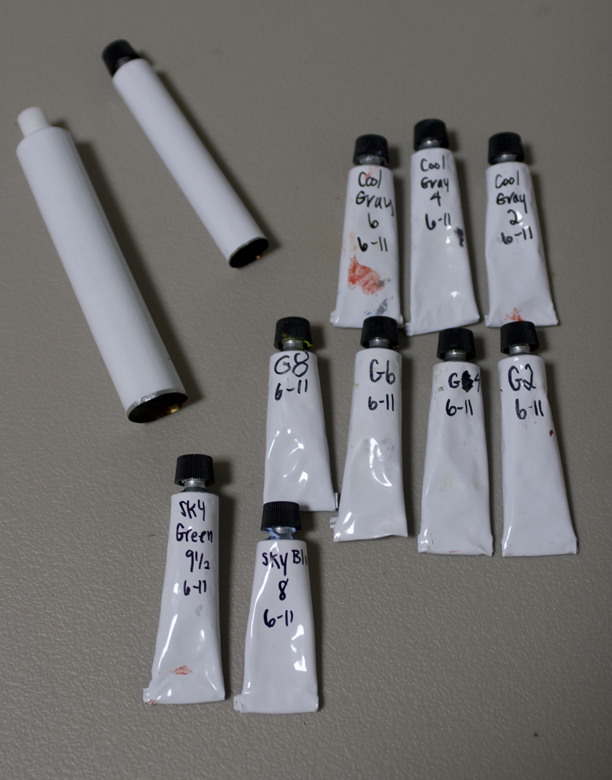
Tubing the Paint
Below is a snapshot of my tubed summer colors. Empty tubes are available at Empty Paint Tubes - JerrysArtarama.com, utrechtart.com, and Pearl Paint 1.25oz Empty Aluminum Paint Tubes. They are available in various sizes from the 22ml that I used in the photo below, 45ml that I use for my fleshtones, and studio tubes. Choosing the size depends on how much you intend to use them.
To fill a tube with color, feed the paint into the open end with a narrow palette knife (or plastic butter knife) and tap the cap-end of the tube on your table to make the paint settle and remove the air. Once the tube is filled, crimp the open end shut with canvas pliers and fold it up.
 |
| 22ml tubed landscape colors. Also shown an empty 22ml tube and an empty 45 ml tube. |
The Shadows
Below Reilly compares the indoor palette and the outdoor palette. Outdoors all the shadows would be cool, ultramarine blue is a great color for adding to the shadows to affect the hue. On a sunny day, these values are never darker than 2, or lighter than 8.
The Lights
The lights can be influenced with cadmium yellow to make them warmer. These value range from 10 down to 5. Black in the light would be 5th value with a touch of cadmium yellow for warmth, and in the shadow painted at value 2 mixing lamp black and white. In the mini illustration, a white shape lays on the ground, painted a warm white at value 9 3/4, chroma 2. In the shadow it becomes a cool value 8, also at chroma 2.
© John Ennis 2011
17 comments:
John,
Thanks for all the hard work you are doing to preserve this information.
As you know there is very little printed from Reilly or his students about outdoor landscape work. Most of his students who have written books have focused on the figure and indoor work. These last few posts help to rectify that oversight.
Thanks Armand, glad to see someone is reading them!
fantastic! many many thanks for sharing this, Armand is right: there is almost nothing out there about Mr Reilly's teaching on colour.
Yeeepee!
Ric
I do more than just read John, I'm experimenting with the colour mixes now. Thanks for posting these John, much appreciated!
Those field studies are wonderful, John!
John
I know people may not always comment, but I read every word you put on here. Please keep this valuable resource going!
This is exactly what I need to know right now. Thanks for making it available.
This is exactly what I need to know right now! Thanks for making it available.
John, can we try to unpack the water locals chart? We have a mixture of raw and/or burnt umber and white at value four for wet earth, that's clear enough. Any guesses as to what those two colors that get mixed with white for the V6 water local are? In Apollo Dorian's book he talks about using either terre verte or a V2 or V3 foliage green for that mix, can you find any confirmation for this?
Tristen, I don't have clue what is indicated for values 3&4, or more importantly, what they would be used for. Maybe white plus the reflected local (foliage 3&4) to value 6. There is an huge folder on painting water that I have to dig into, perhaps that will shed some light.
Fabulous- this is so helpful!
Tristan, here is Jerry Allison's take on the water diagram on the palette. This water portion of the palette is arranged to paint the transition from earth into water.
WHITE is mixed with VIRIDIAN and/or ULTRAMARINE BLUE up to the VALUE-6 to create a darker sky color for reflections. The resulting Blue-Green/Blue "SKY" @Value 6 is then added to more white, Value-10 thus creating graded steps of "SKY" as indicated by the series of dots along that line in the diagram.
WHITE is mixed with RAW UMBER and/or BURNT UMBER to VALUE-4 representing "Wet Earth" seen under or near the water's edge. The resulting Value-4, Wet Earth is used when looking through the THIN (Shallow) water devoid of any sky reflection.
There will be a TRANSITION between looking into the THIN water to see the bottom's wet earth @ Value-4 and looking across THICK water to see the various SKY reflections, Values-6 up to 9.5.
The TRANSITION progression is represented on the Water diagram's solid light line between Value-6 and Value-4.
The earth/sky TRANSITION patterns in a painting are determined in part by the water's surface (ie: calm pools, ripples, rapids, or turbulent waves) and the angle of reflection toward the viewer.
Thanks so much for the info, John, and thanks of especially to Jerry Allison as well. Eagerly awaiting the next update...
John, thank you so much for this information. It's fascinating! In my landscape painting adventures I read somewhere about an artist who uses different combinations of ultramarine blue, viridian, and a little cad red light to mix just about any kind of water. I tried it and it works-for grey days as well as sunny. Then it occurred to me that, since water reflects sky, the same combination of colors could be used to mix the elusive shades of sky, both at the horizon and at the top of the "vault." It worked! For a long time I also have used thalo blue and green especially for the pale but brilliant colors near the horizon. It was so interesting to read about how Reilly used these same colors and how he thought about clouds and atmospheric conditions. Thank you so much for your efforts in sharing this treasure trove of information! And by the way I loved seeing your landscape paintings!
Thanks for posting all this information on Reilly' landscape palette. I sometimes use what is called the DuMond palette which is essentially the same as Reilly's who was a student of DuMond's.
It's interesting to see that he abbreviated the palette down to the essentials that he thought worked best. In DuMond's and Mason's palette they both mixed up 9 values of greens, blues, grays and in Mason's case violets.
This painting captures rich imagination of the artist and has flamboyant colors. The artist has used flamboyant colors in this painting, which looks amazing on walls of any color.
Post a Comment